Goodreads
A heuristic evaluation and redesign of Goodreads, the online reading community and book recommendation platform, specifically assessing its onboarding process to identify usability challenges, suggest improvements, and implement enhancements.
Role: UX Researcher, UX / UI Designer
Team: Alex Koch-Fitsialos, Eleni Katsuras
Project Length: 2 Weeks, Mar 2024
Tools: Figma


Background
Introduction to Goodreads
Goodreads is the world’s largest site for readers and book recommendations, committed to helping readers discover books they love and enrich their reading experiences.
As a team, our goal was to evaluate the usability of Goodreads' desktop view using a heuristic evaluation. Specifically, we aimed to identify usability issues and areas for improvement to enhance the platform's design.
Onboarding task flow
A new Goodreads user’s journey
Our focus was specifically on evaluating the Goodreads onboarding process — serving as the first impression for prospective Goodreads users, the onboarding journey is one of the site’s most important flows. Within our heuristic evaluation, we approached the onboarding process from the perspective of a new reader looking to join a community centred around reading.
Since the majority of critical usability issues were found within the final three steps of the onboarding flow, our evaluation focused in on these specific stages:

Introduction to Heuristic Evaluation
How do we measure usability?
A heuristic evaluation is a method for identifying usability issues within a user interface design.
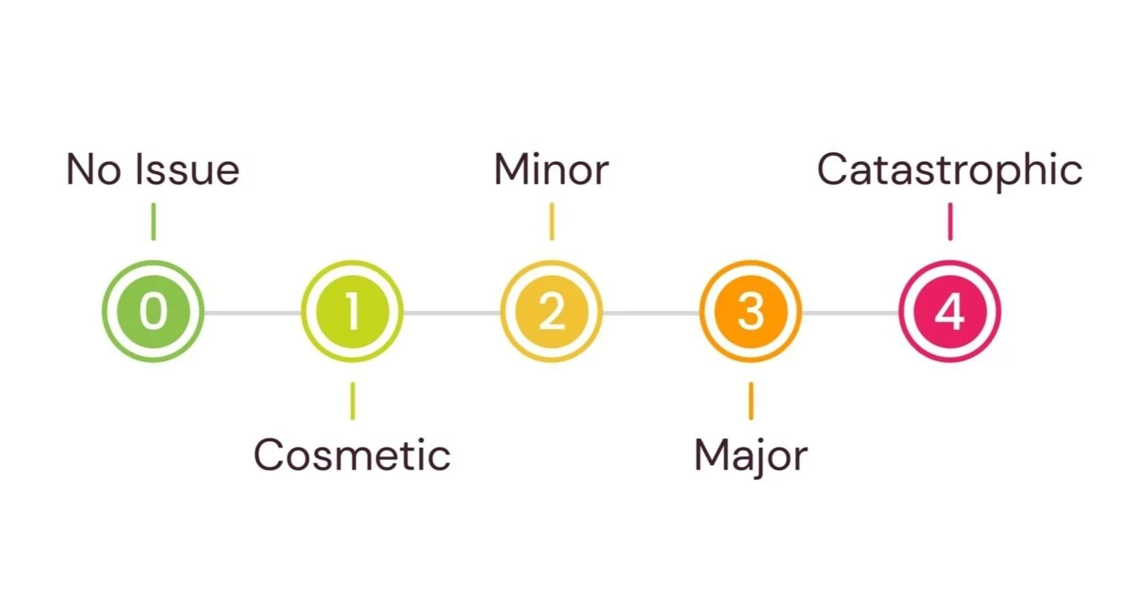
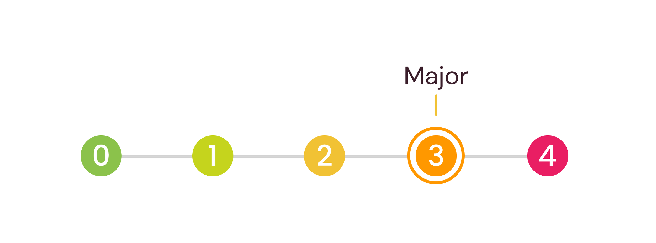
We measure these issues on a severity scale ranging from 0 to 4 — where 0 indicates no usability problems, and 4 signifies a critical usability concern that impedes a user from successfully completing a task.
The 10 Usability Heuristics
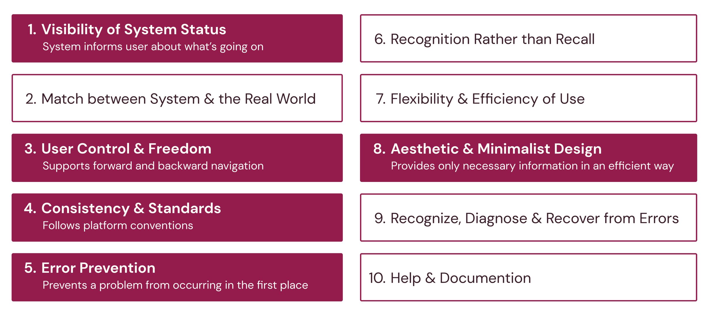
The usability of a product is assessed based on Jakob Nielsen’s 10 Usability Heuristics, serving as general principles for interaction design. Of the 10 heuristics, we identified five main heuristics that were violated within the Goodreads onboarding journey:

Goodreads’ Onboarding Journey
Heuristic Evaluation
Onboarding: Step 3
Select Your Favourite Genres page
#1: User Control & Freedom
Violation: Impeding user navigation
On the “Select Your Favourite Genres” page, the user can’t move backwards across the onboarding process due to the omission of a back button.

Recommended solution: Add a back button to give users the ability to go to the previous step in the process.
#2: Visibility of System Status
Violation: Confusing progress status
On the same screen, the progress bar is missing a step and is mislabeled — the user is currently on the “Select Your Favourite Genres” page, yet the progress bar indicates that they are on “Rate Books”. This prevents accurate progress tracking and creates confusion for the user.

Recommended solution: Add a step to the progress bar to accurately indicate the user’s onboarding position.
Onboarding: Step 4
Rate Books page
#3: Consistency & Standards
Violation: Unconventional CTA buttons
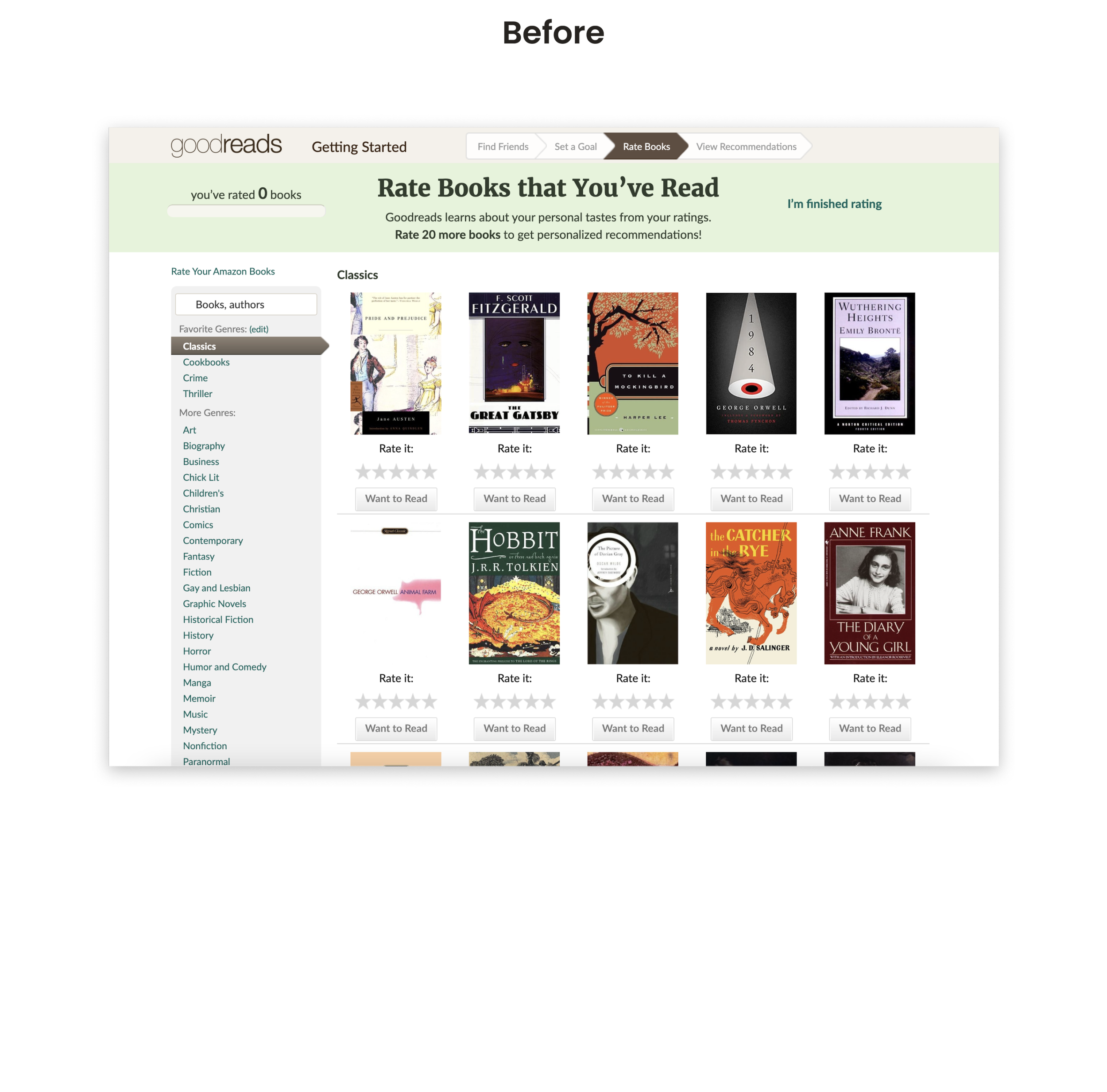
On to the “Rate Books” page, the call-to-action (CTA) button designed to advance the user through the onboarding process doesn’t match internal or universal button styles, making it unclear to new readers that it’s a means to move forward.

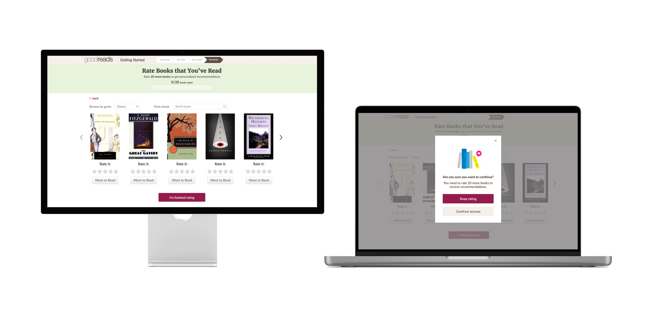
Recommended solution: Increase the visibility of the CTA and match it to button standards used across the Goodreads platform.
#4: Error Prevention
Violation: No confirmation option
New readers need to review at least 20 books to get recommendations, but they're not warned beforehand, leading to users inadvertently not receiving any recommendations. The instructions for rating 20 books are also unclear and scattered, making them difficult to follow.

Recommended solution: Simplify user instructions and add a confirmation popup if the user rates less than 20 books.
#5: Aesthetic & Minimalist Design
Violation: Too much information
New readers are presented with an overwhelming amount of genre options at once, impacting their ability to effectively choose books to receive tailored recommendations.

Recommended solution: Utilize progressive disclosure to not overwhelm the user and simplify the task at hand.
Onboarding: Step 5
Receive Recommendations page
#6: Consistency & Standards
Violation: Unclear landing location
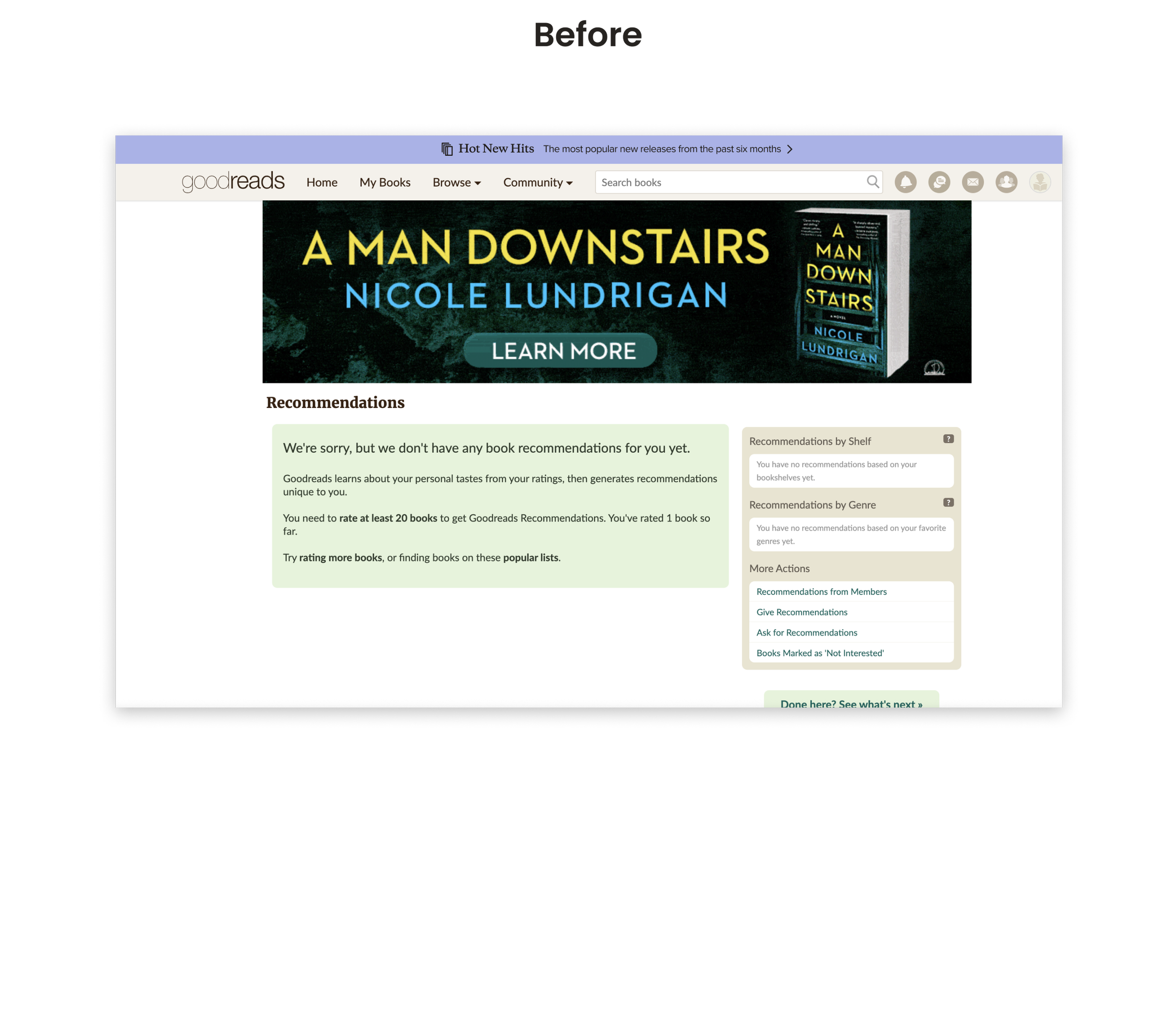
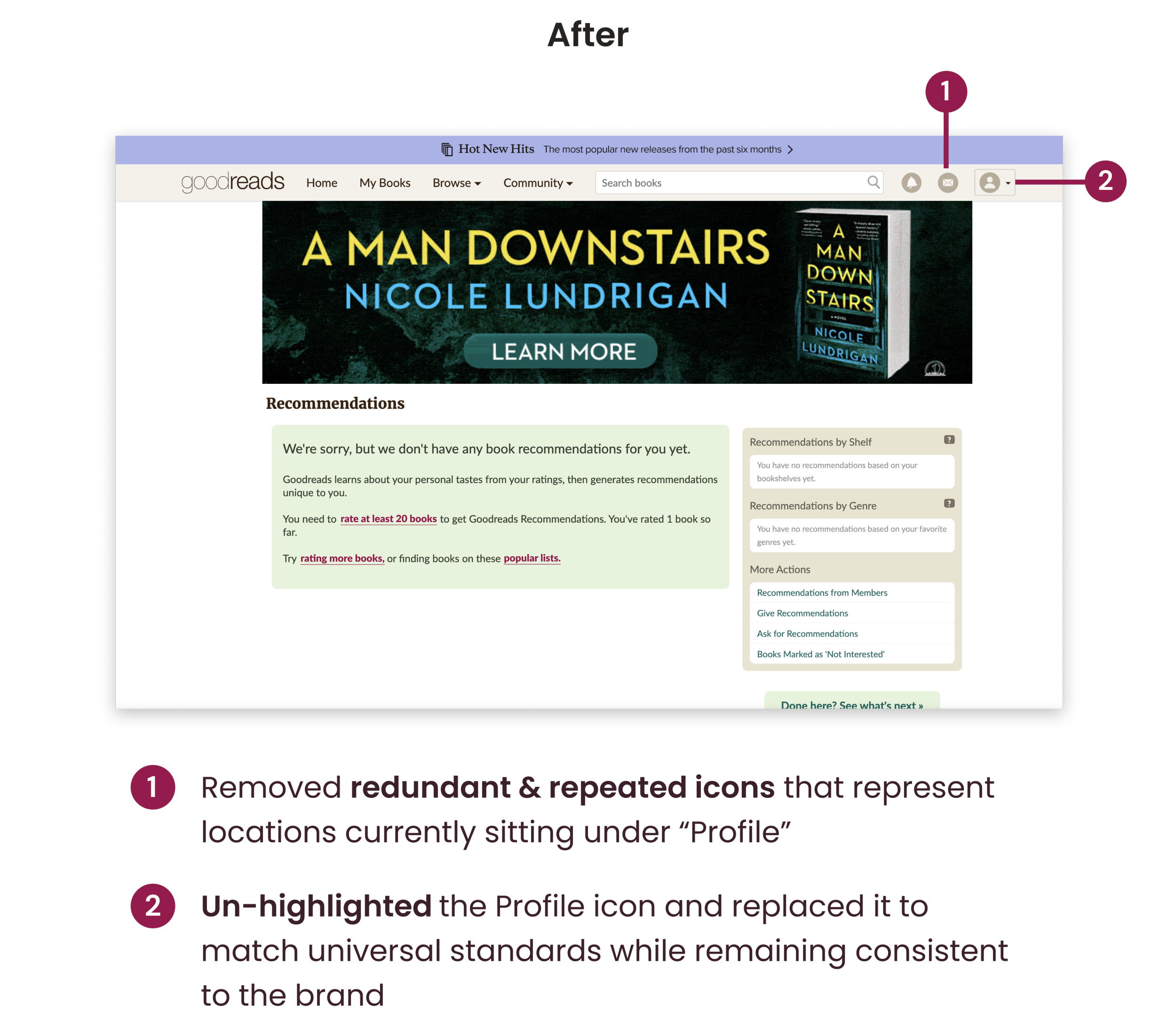
The user finishes their onboarding journey on the Recommendations page, but it appears that they are on their “Profile” based on the icon highlighted.

Recommended Solution: Unhighlight the profile icon to reduce confusion.
#7: Consistency & Standards
Violation: Redundant & unclear icons
The navigation icons on the top right of the "Receive Recommendations" page are unlabelled, making it unclear what each icon represents since they don’t follow universal conventions. In addition, the icons for "Friends" and "Discussions" are duplicated under "Profile", which is redundant.
Recommended Solution: Implement labels & recognizable icons, and reduce icons included to avoid redundancy.

Goodreads’ Onboarding Journey
Redesign
Process
The redesign
In redesigning Goodreads’ onboarding journey, we aimed to implement the design recommendations based on the 7 heuristic violations identified while staying true to the tone and brand of Goodreads’ current platform.
Goodreads’ style guide
Upon evaluating Goodreads’ current branding, we observed the absence of a specific interaction colour. To address this, we opted to introduce a merlot accent colour that harmonizes with the brand's existing palette, adds depth and communicates a sense of sophistication.
Onboarding: Step 3
Select Your Favourite Genres page
Onboarding: Step 4
Rate Books page
Onboarding: Step 5
Receive Recommendations page
Hi-fidelity prototype
Revised onboarding journey
Here's a final walkthrough of the prototype for the improved Goodreads onboarding process, encompassing steps 1 through 5, and incorporating all the recommended solutions identified in our heuristic analysis.
Final reflections
Next steps
📌 Addressing secondary usability issues
As our goal was to pinpoint the most crucial heuristic issues within the onboarding flow, our next steps involve delving deeper into the first and second screens to identify less urgent but still significant issues to enhance usability.
🔍 Extending the scope
Continuing on with our heuristic analysis, we would also set out to conduct a site-wide evaluation to ensure consistency and standards are maintained throughout.


